12.10.2026
How to Choose the Right Colors for Executive Suites
Selecting the right color palette for an executive office suite involves far more than personal aesthetic preference; it requires balancing architectural dimensions, natural illumination, tactile textures, and corporate identity. The visual tone established in a leadership workspace immediately signals stability, decision-making authority, and organizational culture to visiting partners and team members. Choosing discordant or overwhelming finishes can make even mastercrafted furniture appear cluttered or uninspired, whereas a thoughtful palette elevates both functional focus and architectural prestige.
When curating a C-suite interior, color decisions should be rooted in physical space parameters. Floor finishes, wall paint undertones, ceiling height, and daylight exposure dictate which surface materials will thrive. Whether you are specifying natural veneer, matte lacquer, brushed metals, or fine leather, achieving harmony across these surfaces is essential. Exploring how dedicated executive office suites interact with environmental variables allows corporate planners and executives to design spaces that command respect while maintaining day-to-day comfort.
The Strategic Impact of Color on Corporate Identity and Prestige
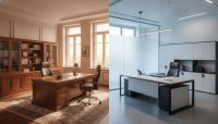
Executive suites serve as the primary setting for high-stakes negotiations, confidential strategy planning, and institutional representation. Because visual environments shape cognitive impressions, the primary color palette of your executive desk functions as an extension of brand positioning. Conventional, high-trust sectors such as corporate law, investment banking, private equity, and heavy industry traditionally lean toward deep, grounded tones. Rich walnut, smoked oak, charcoal, and dense black finishes convey permanence, institutional weight, and enduring security.
Conversely, dynamic and innovation-focused industries—including software technology, creative agencies, venture capital, and architectural consultancies—often benefit from progressive, light-reflective palettes. Bleached oak, soft greige, slate gray, and matte white details soften traditional corporate hierarchies, projecting transparency, open communication, and modern agility. Rather than saturating large furniture surfaces with overt corporate brand colors, architectural best practice favors using brand hues sparingly in credenza reveals, acoustic wall panelling, or chair stitching to maintain timeless sophistication.
Balancing Natural Light and Spatial Dimensions
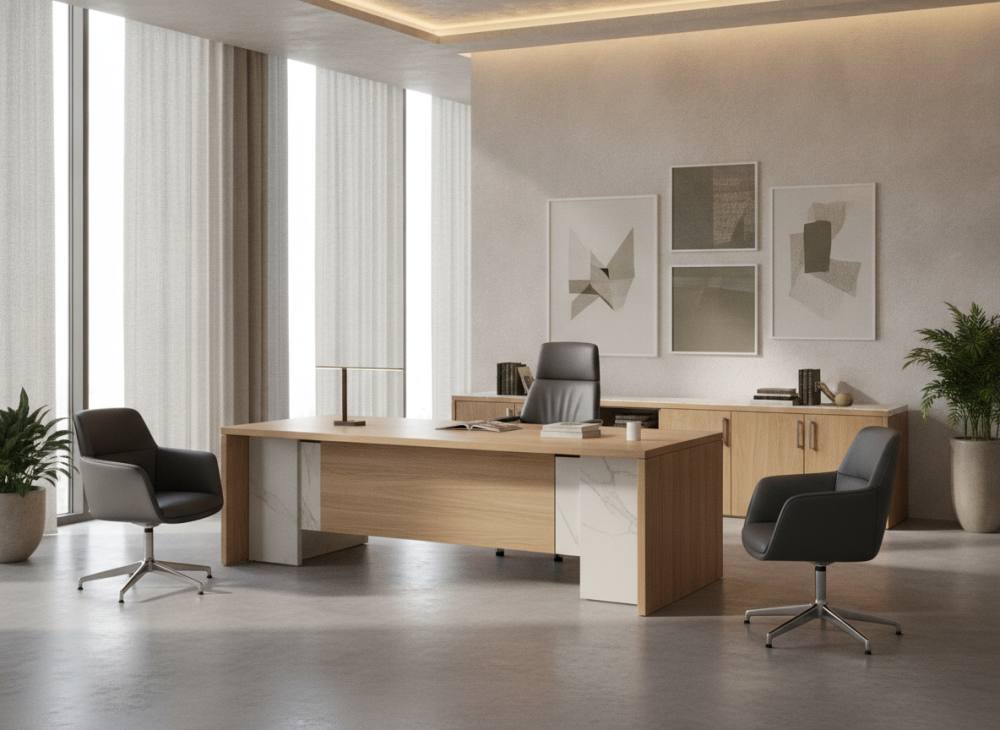
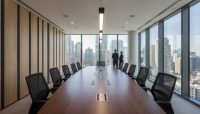
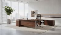
A furniture suite displayed in an expansive showroom can produce an entirely different visual impression once placed inside an actual office. Room volume and daylight orientation remain the two most influential factors when selecting desk finishes. In corner suites with expansive glass curtain walls and continuous daylight, darker wood tones such as espresso walnut, bog oak, and deep graphite can be integrated without visually shrinking the room. Ample natural light brings out grain depth, balancing the perceived density of substantial executive desks.
For executive offices with north-facing exposure, smaller square footage, or standard ceiling heights, dense dark finishes can inadvertently create a cave-like atmosphere. In these configurations, opting for light natural timber, soft ash, cashmere tones, and warm off-white work surfaces reflects ambient light across the room. Controlling visual reflectance helps reduce ocular fatigue during prolonged screen use while keeping the room feeling expansive and organized. Indeed, fundamental considerations when choosing office furniture consistently prioritize light balance and physical volume to prevent spatial overcrowding.
Executive Suite Color Palettes and Material Harmony
Modern executive furniture rarely relies on a single monotone finish. Superior architectural presence is achieved through deliberate multi-material compositions that balance warm organic textures against structured architectural elements. When investing in an upscale VIP executive office set, ensuring refined tonal transitions between each integrated material is paramount.
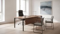
- Natural Walnut and Matte Anthracite: A warm walnut desktop paired with dark anthracite returns and modesty panels combines organic warmth with structured, contemporary authority.
- Veined Marble Patterns and Dark Metal Framework: Desktop inserts in calacatta or nero marquina textures supported by electrostatically coated matte black or gunmetal framing project structural precision and refined luxury.
- Monochromatic Slate and Light Ash: For executives prioritizing minimalist clarity, combining soft birch or blonde ash with mist-gray lacquered cabinets fosters a distraction-free, contemplative work environment.
The following comparative overview illustrates how distinct color and material combinations interact with office lighting conditions and organizational character:
| Color & Material Palette | Perceived Atmospheric Character | Spatial & Lighting Requirements | Recommended Industry Profiles |
|---|---|---|---|
| Deep Walnut & Matte Black | Authoritative, established, grounded | Generous floor area, ample daylight | Legal practices, finance, industrial groups |
| Natural Oak & Anthracite Lacquer | Balanced, contemporary, approachable | Medium to large rooms, standard lighting | Management consulting, engineering, holdings |
| Ash Gray & Soft Matte Off-White | Luminous, minimalist, calm | Compact rooms, limited daylight windows | Technology, digital media, design firms |
| Smoked Oak & Brushed Bronze Accents | Curated, upscale, distinguished | High ceilings, directional warm lighting | Real estate development, private family offices |
Note: Evaluations are based on architectural design principles and industry observations. Search Console, Analytics, or primary sources must be used for precise measurement; there are no fabricated numbers here.
Coordinating Secondary Furniture and Upholstery Elements
While the executive desk acts as the visual anchor of the room, secondary storage units, conference side-tables, wall credenzas, and seating must speak the same design language. Repeating the dominant wood veneer on rear storage facades maintains continuity across sightlines. However, matching every single surface identically can make an office feel flat and monotonous. A proven design solution is pairing neutral cabinet carcases in graphite or warm taupe with timber front doors that mirror the desk surface.
Upholstery provides an ideal medium for introducing deliberate tonal contrast. When the workstation features dark timber, selecting premium executive chairs upholstered in cognac, saddle tan, or deep espresso leather highlights the primary seating zone as an intentional focal point. For client and guest armchairs, soft-touch woven fabrics in slate, warm stone, or olive establish an inviting, hospitable balance that tempers the formal weight of the main desk.
Common Pitfalls in Executive Office Color Selection
Even premium office furniture can lose its visual stature if surrounding color interactions are overlooked during procurement. Avoiding these frequent specification missteps ensures enduring aesthetic value:
- Zero Contrast with Floor Coverings: Selecting timber furniture that directly mirrors the tone of wood parquet or carpet eliminates spatial depth, causing the desk to dissolve into the floor. Aim for at least two shades of visible value separation between flooring and furniture legs.
- Excessive High-Gloss Finishes: High-gloss lacquered surfaces create harsh specular highlights under commercial ceiling downlights, resulting in disruptive glare during long working hours. Matte and satin-sheen finishes diffuse light gently, conveying modern refinement.
- Clashing Undertone Temperatures: Placing warm golden-oak desks against cool blue-gray walls creates an uncomfortable visual friction. Warm woods pair naturally with earthy, cream, or charcoal tones, whereas cool gray-toned woods coordinate best with crisp neutrals and black steel.
- Over-Saturating with Dark Finishes: Enveloping an office in dark walls, dark window dressings, and an all-black desk suite produces visual heaviness that can diminish energy levels throughout the workday.
Step-by-Step Color Specification Checklist
Follow this systematic evaluation sequence before finalizing your executive suite color specifications:
- Evaluate Spatial Exposure: Note window orientations and the hours of direct sun exposure the office receives to gauge how deep your furniture finishes can safely be.
- Cross-Reference Physical Finish Swatches: Always place physical wood, lacquer, and metal swatches directly on your actual office flooring under both daylight and artificial fixtures.
- Calibrate Lighting Color Temperatures: Ensure ambient lighting operates within neutral white ranges (3000K to 4000K). Overly amber illumination will distort cool veneers, while stark blue lighting flattens natural wood character.
- Define the Leadership Tone: Determine whether the executive role requires projecting traditional institutional weight or contemporary, collaborative transparency.
Frequently Asked Questions
Can I use charcoal or black furniture in a compact executive room?
Yes, provided the overall composition includes sufficient visual lightness. Choose desks with slim black metal legs and open architectural frames rather than solid, bulky pedestal bases. Combining dark framework with a lighter wood tabletop and keeping peripheral walls light-toned ensures the room remains open and dynamic.
What is the most timeless wood tone for an executive suite?
Natural walnut tones are universally considered the most enduring in professional workspace design. Balanced walnut neither skews too red nor excessively yellow, allowing it to transition seamlessly across changing corporate styles over years of service.
Should executive seating strictly match the desk tone?
Not necessarily. In fact, a calibrated contrast often looks more refined. Pairing a dark wood or charcoal executive desk with a warm cognac or tan leather chair creates an intentional visual centerpiece that elevates the design beyond standard catalog uniformity.
Which surface finish is more practical: wood veneer or matte lacquer?
Both perform well when manufactured to high commercial standards. Natural wood veneers excel at disguising minor everyday dust and fingerprints while providing organic tactile warmth. Matte lacquers deliver clean, architectural lines suited for sleek modern schemes, provided they feature anti-fingerprint surface treatments.
To evaluate material swatches, optimize spatial layouts, and develop an executive interior customized to your corporate vision, contact our team for specialized architectural guidance.