01.11.2026
How Office Furniture Colors Impact the Work Environment
In commercial and corporate interior design, the color schemes and surface finishes selected for office furniture do far more than define visual aesthetics; they directly influence employee focus, mental stamina, spatial orientation, and day-to-day workflow efficiency. Choosing a palette for desks, storage systems, and seating is rarely a purely decorative decision. Instead, it serves as a deliberate architectural strategy that governs light reflectance, visual clutter, institutional identity, and ambient comfort across an entire organization. When planning a functional commercial floor plan, material finishes and chromatic tones must be approached as interconnected components of ergonomic workplace design.
The Impact of Color Psychology in Office Furniture on Space and Employees
Environmental color psychology investigates how ambient surroundings trigger cognitive, physiological, and emotional reactions in occupants. For professionals spending eight or more hours a day within a commercial space, the physical surfaces they interact with—such as work surfaces, credenzas, and task seating—serve as constant visual stimuli. Deep, grounded tones convey organizational stability, structure, and authority, while bright, neutral tones foster an atmosphere of clarity, openness, and mental calm.
To preserve long-term cognitive stamina, facility managers and designers must maintain harmony between furniture chromatic saturation and ambient lux levels. Highly saturated, vibrant surfaces on large desk tops can reflect excessive illumination, generating harsh contrast that triggers visual fatigue and sensory overstimulation by late afternoon. Conversely, an entirely monochromatic, dull layout risks creating an uninspiring, lethargic ambiance. The objective in high-performing office design is to strike an intentional balance: choosing tones that eliminate visual glare without stripping the space of architectural warmth or corporate character.
Color and Furniture Distribution by Work Zone
Modern workplaces rarely adhere to a single operational speed. Different departments fulfill distinct operational functions, requiring customized furniture finishes and color distributions rather than a rigid, uniform template throughout the entire floor plan.
Prestigious Color Balance in Executive and C-Suite Offices
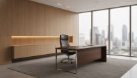
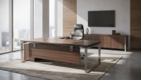
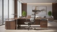
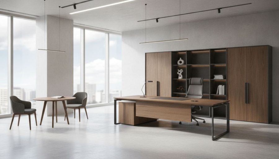
Executive workspaces serve as the primary setting for strategic governance, confidential negotiations, and high-stakes client engagement. In these leadership suites, specifying an architectural executive office suite finished in dark walnut, smoked oak, charcoal, or graphite provides a tangible sense of durability and permanence. Natural timber grain coupled with matte dark surfaces conveys deliberate authority. However, to keep large executive suites from feeling overly dense or shadowy, complementary seating and paneling should incorporate balanced neutrals like stone gray, warm beige, or soft cream. As explored in our comprehensive guide on how to choose executive suite colors, visual prestige in senior management spaces relies on calculated contrast rather than uniform darkness.
Focus-Enhancing Tones for Operational Teams and Open Offices
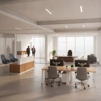
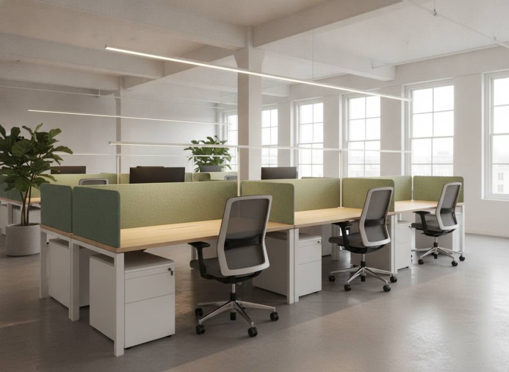
Open-plan administrative zones house continuous digital processing, shared communications, and long hours in front of computer monitors. In these high-density areas, furniture surfaces should optimize ambient lighting rather than absorb it. Selecting workstation desks featuring matte white, bleached oak, soft dove gray, or light ash tabletops significantly enhances natural light dispersion, helping compact layouts feel airy and unencumbered. Incorporating subdued secondary colors—such as sage green, dusty blue, or slate gray—into upholstered acoustic dividing screens or desk frame structures helps quiet the visual noise typical of open bench layouts.
Dynamic Accents in Meeting and Brainstorming Spaces
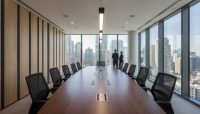
Collaborative areas, boardrooms, and creative breakout zones demand an interior rhythm that encourages active participation, communication, and collective problem-solving. When selecting a functional meeting table, contrasting designs that combine solid wood veneers with structural black metal frames or architectural stone accents deliver a contemporary, focused baseline. Accompanying visitor or conference seating can incorporate warm, deliberate accents—such as terracotta, mustard, or deep navy upholstery—to stimulate engagement without disrupting professional composure.
Office Furniture Color and Material Interaction Matrix
The qualitative assessment matrix below highlights standard furniture color families, their primary cognitive and spatial attributes, ideal placement zones, and recommended material pairings in commercial environments.
| Color & Finish Profile | Spatial & Cognitive Impact | Recommended Application Zone | Complementary Materials & Accents |
|---|---|---|---|
| Natural Oak & Warm Woods | Biophilic warmth, visual calm, tactile comfort, and timeless appeal. | Private executive suites, managerial desks, reception waiting lounges. | Matte black metal profiles, tinted glass, structured textured fabrics. |
| Anthracite, Graphite & Smoked Finishes | Institutional authority, sharp spatial definition, modern visual grounding. | C-suite private offices, formal boardrooms, executive storage wall units. | Rich walnut veneers, brushed brass hardware, light gray leather upholstery. |
| Soft White, Mist Gray & Sand | Maximized light dispersion, perceived spaciousness, tidy and clean aesthetic. | High-density open offices, multi-user benching, training facilities. | Solid wood edge bands, colorful acoustic fabric screens, anodized aluminum. |
| Subdued Green & Slate Blue | Stress moderation, sustained visual focus, professional reassurance. | Acoustic room dividers, task chair upholstery, collaborative banquettes. | Pale wood surfaces, brushed stainless steel, monochromatic floor tiles. |
Note: The classifications in this table are based on architectural color theory principles. For precise measurement, primary sources or operational data should be consulted; there are no fabricated statistics here.
Common Color Selection Mistakes in Office Furnishing
During commercial renovations or bulk furniture procurement, seemingly minor color miscalculations can undermine operational comfort and spatial ergonomics:
- Neglecting Ambient Light Quality: Positioning dark graphite or solid black workstations in north-facing or windowless interiors creates an oppressive, shadowy atmosphere. Furniture reflectance values must always be calculated relative to window placement and fixture lumen outputs.
- Relying on Overly Sterile Monochromes: Furnishing an entire open office with high-gloss white desks, white screens, and pale flooring produces an institutional, clinical environment. High reflectance from stark white surfaces under 4000K fluorescent or LED fixtures often induces digital eye fatigue over extended shifts.
- Overusing Saturated Brand Colors: Corporate visual identity guidelines often emphasize high-energy primary colors like vivid red or bright yellow. Applying these shades across primary desk surfaces or large storage façades creates intense visual distractions; bold brand hues are far better reserved for accent seating, acoustic pin-boards, or entry signage.
- Ignoring Glare and Finish Sheen: High-sheen lacquers and reflective laminate tops catch ceiling task lighting, producing directional glare that compromises screen readability. Matte, soft-touch, or lightly textured wood-grain surfaces are vastly superior for workstation ergonomics.
Step-by-Step Checklist for Establishing the Right Color Palette
Corporate interior projects require a structured, practical approach to furniture finish selection. Use the following framework to guide purchasing and space planning decisions:
- Examine the Physical Envelope: Document ceiling height, pillar distribution, and natural daylight penetration. For spaces with low ceilings or limited window area, prioritize light wood grains and neutral core furniture components to preserve an open feel.
- Map Functional Department Needs: Reserve calming neutral desk tops and subdued acoustic blues or greens for deep-focus operational departments. Introduce higher-contrast timbers and structured dark accents into client presentation rooms and leadership offices.
- Implement the 60-30-10 Interior Rule: Assign roughly 60% of the visible spatial palette to dominant background neutrals (walls, carpets, ceiling treatments), 30% to primary furniture finishes (desking surfaces, credenza shells, architectural framing), and 10% to dynamic accent tones (seating textiles, acoustic wall tiles, accessory hardware).
- Test Material Samples In Situ: Swatches viewed in digital catalogs or lighting showrooms will appear distinctly different under your facility's actual color temperature. Always review physical laminate, veneer, powder-coat, and upholstery swatches on-site during both morning daylight and evening electric lighting hours.
For additional insights into planning a balanced, ergonomic, and durable commercial work environment, review our detailed guide on what to consider when selecting office furniture. To develop a customized spatial layout and material palette tailored to your brand's unique operational needs, please contact us to consult directly with our commercial interior specialists.
Frequently Asked Questions About Office Furniture Color Selection
What furniture colors work best for compact or small office spaces?
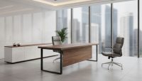
For compact spaces, furniture with light-reflective finishes is essential. Natural bleached oak, light ash, warm white, and soft light gray work surfaces paired with slender metal leg profiles allow light to pass through the room smoothly, maximizing the feeling of usable space without visual overcrowding.
Is it risky to specify dark-toned furniture in a workplace?
Dark furniture is not inherently problematic, provided it is supported by appropriate natural or artificial illumination and balanced by pale architectural finishes. While dark desks establish authority in spacious executive suites, using them in compact, low-light spaces can make rooms feel confined and dim. Balance is achieved through contrasting light floors, pale upholstery, or open wall paneling.
Should natural wood veneers be reserved for executive suites or used in open offices?
Wood finishes provide value in both settings, but species and stain selections should reflect the zone's functional purpose. Rich walnut, smoked oak, and deep ebony stains are commonly used to convey prestige in private executive offices. In contrast, pale birch, Scandinavian oak, and natural ash are widely utilized in open-plan workstation setups to bring biophilic warmth and lightness to team areas.
Can furniture color schemes genuinely impact employee stress levels?
Yes. Commercial architectural studies consistently observe that chaotic or excessively saturated color palettes can contribute to sensory fatigue. Conversely, palettes incorporating biophilic design principles—such as muted earth tones, soft greens, slate blues, and warm natural woods—help lower sensory stress and maintain a calm, organized work environment.